 OutDept
Why We Rebuilt the OutDept Website — and What Actually Changed Under the Hood
Same team, same accountability, new site from the ground up: real multi-language support, a services page that scopes work honestly, a blog you're reading right now, and an outsourcing plan built for companies that want one team instead of five vendors.
The old OutDept site did its job: it explained who we are, listed a few services, and had a contact form. What it didn't do was scale with the business. As the team took on more case studies, more languages of client, and a wider range of engagements — from a single landing page to running a client's entire technical department — the site stopped being able to represent that honestly. So we rebuilt it, not as a coat of paint, but as new architecture underneath.
This article walks through what actually changed, because "we redesigned our website" is a sentence that means almost nothing on its own. Here's what it actually involved.
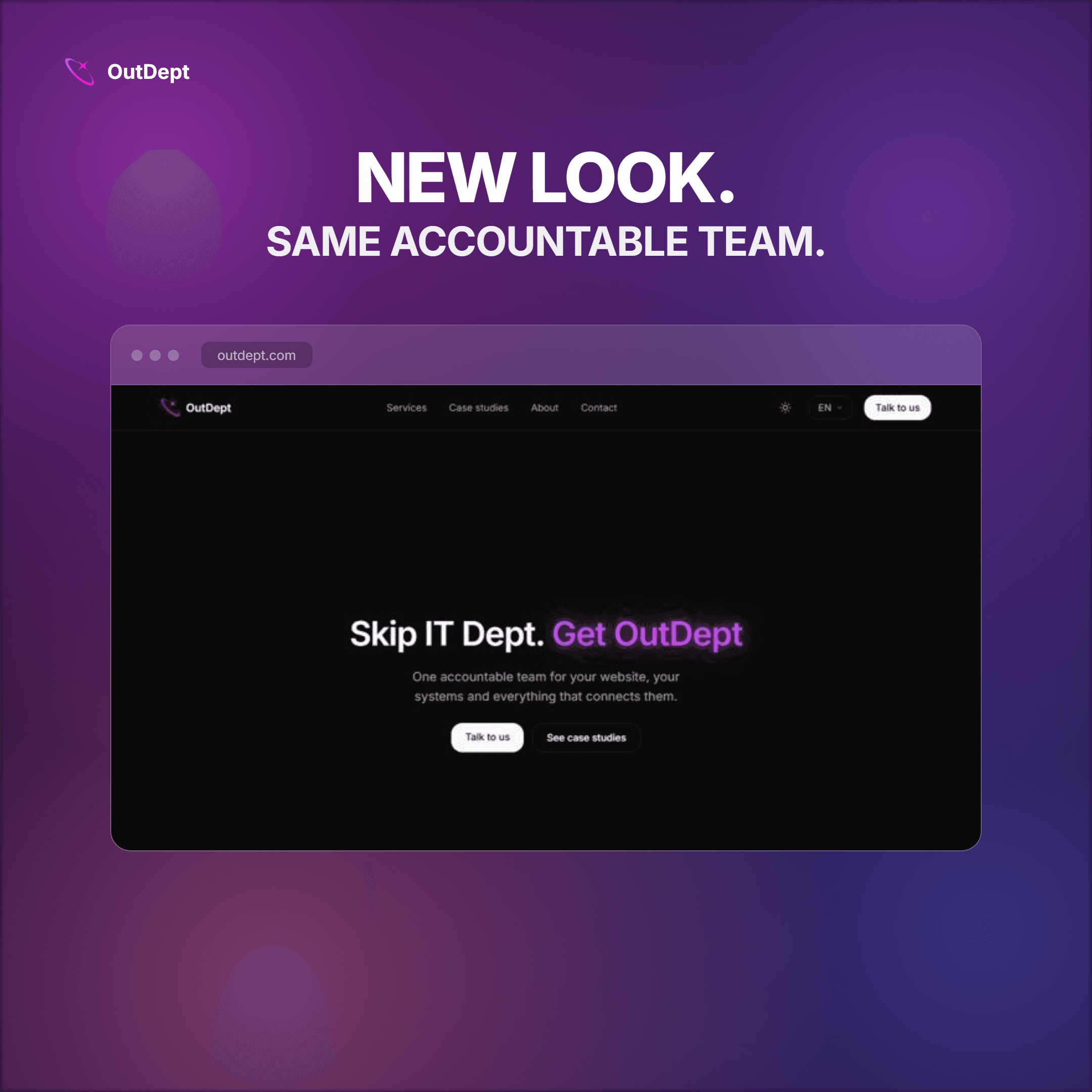
Real multi-language support, not a translation plugin
The previous site had one language. The new one is built around a proper locale system: English, Russian, Thai and Chinese, each served as a full, independent version of every page rather than a machine-translated overlay bolted onto an English original. A visitor's browser and cookie preference route them to the right locale automatically, and URLs stay clean — no `/en/` or `/ru/` prefix cluttering every link you share.
This matters because OutDept works with founders and teams across Thailand, Russia and China, and a site that only speaks English to all of them is quietly excluding people from understanding what we actually do before they even reach out.
A services page that scopes honestly, and case studies that back it up
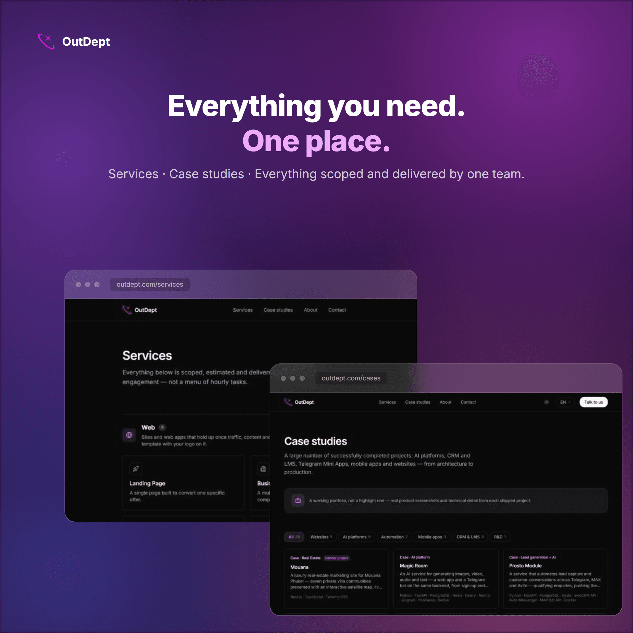
The new services page lists what we actually build — websites, web apps, AI platforms, automation, CRM and LMS systems, mobile apps — grouped so a visitor can find their specific need in seconds instead of reading a wall of buzzwords. Every category links to real case studies: Mouana, Magic Room, Prosto Module and others, with real screenshots and the actual tech stack used, not a highlight reel of logos.
The blog you're reading right now
The blog is new. It exists because a huge amount of what we explain to prospective clients in a first call — what web development actually covers, what a CDN does, why a business needs a domain versus just a social media page — is the same explanation, over and over. Writing it down once, properly, means a business owner can get genuinely useful answers before ever booking a call, and it means the site itself becomes something worth finding through search instead of just a digital business card.
An outsourcing plan for companies that don't want five different vendors
The new `/outsourcing` page lays out a concrete list of services and, for the first time, a monthly Full Department subscription — one accountable team covering a company's website, backend systems and everything that connects them, instead of juggling a freelance designer, a separate backend developer, a DevOps contractor and an agency for the next redesign. Pricing is a conversation, not a fixed number, because the right scope for a five-person startup and a fifty-person company genuinely aren't the same thing — but the offer itself is now something you can point to and ask about directly.
Built to actually work on a phone
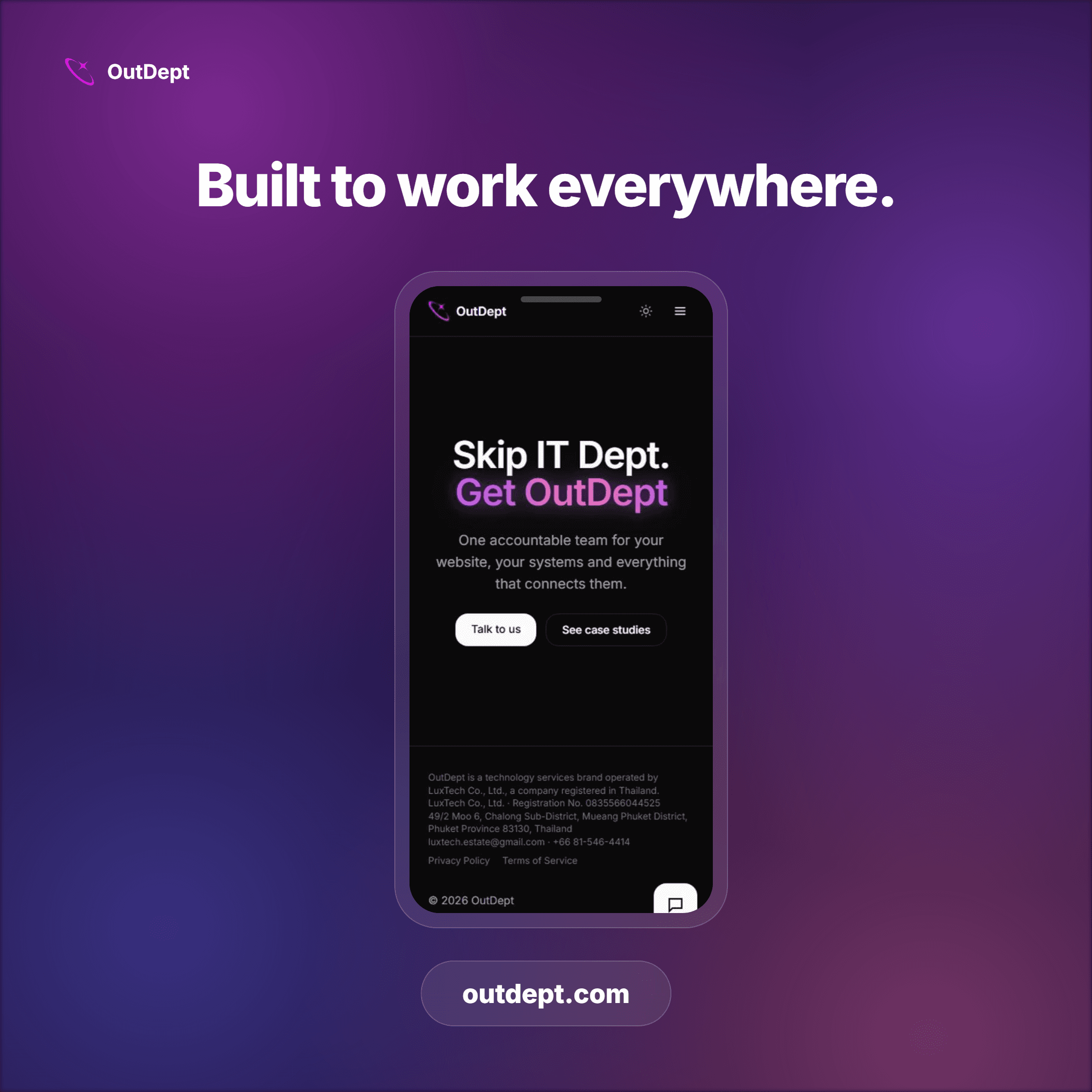
A meaningful share of the traffic any Thai business gets arrives on a phone, not a laptop. Every page on the new site — navigation, the language switcher, the services grid, the contact form — was checked and fixed at mobile, tablet and laptop widths, not just designed at desktop size and hoped into working everywhere else. If something is hidden on mobile, it has a working mobile equivalent; nothing on this site drops functionality just because the screen got narrower.
Reaching us stayed simple, on purpose
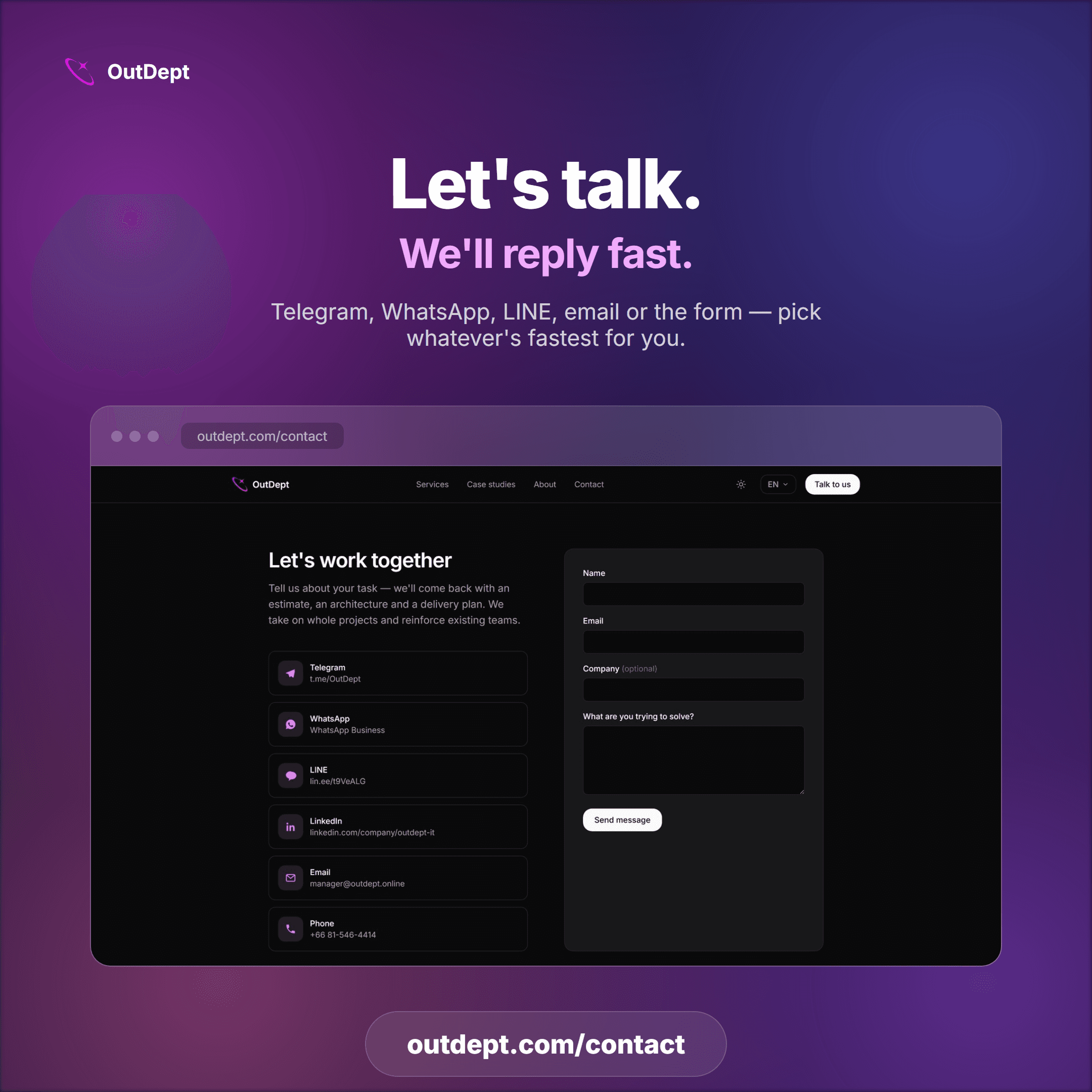
The contact page didn't get more complicated — it got more honest about how people actually prefer to reach out. Telegram, WhatsApp, LINE, LinkedIn, email or the form: pick whichever is fastest for you, and expect a real reply, not an autoresponder.
None of this changes who's behind the work. It's the same accountable team — the redesign just makes that easier to see, in whichever language you read it in.
The bottom line
A website redesign that only changes fonts and colors isn't really a redesign — it's decoration. This one changed the architecture underneath: real localization instead of a translation layer, a services structure that scopes work honestly, a blog that answers real questions, a subscription offer for companies that want one team instead of five, and a mobile experience that was actually tested rather than assumed.
If you're curious what any of this looks like for your own business — a new site, a redesign of an existing one, or handing off your whole technical department — that's exactly the kind of conversation the new contact page was built for.
Have a project behind this question?
Tell us the problem, not the service name — we'll scope it properly before quoting anything.
Talk to us